
Let's think outside the box
Your website is the core of your digital presence. We will ensure it represents you authentically, and delivers on your goals.
Market Leading Websites
Orchestrating all the skills required to create and deliver a stand-out, robust, and high functioning website.
Custom Websites
No templates here. Your site will uniquely position you for the groups of people you set out to serve.
Cost Effective
We work to your budget. Our local team, all in the one office, ensures efficient delivery without wastage.
Extendable
We build with the future in mind. Our mantra is technology to grow, so that's what we expect.

Modern
User experience is a large determinant of time spent on your website. We design and build awesome experiences.
Scalable
Need to scale to millions of users? No problem. Equally, if you don't need scale we won't over capitalise your infrastructure.
Secure
Underpinned by security standards. Maintained to keep your site safe.
Built for Digital Marketing
Our software engineering team works closely with our digital marketers, for a seamless handover and ongoing traffic building.
How do we deliver your new website?
Our founder's experience of website design and development spans more than 3 decades. Over that time we have been constantly adapting to vast technology changes as well as honing our delivery process to ensure
successful website projects, everytime.
Helping you every step of the way
Either in person or using online tools to collaborate remotely, we will guide you through our process of:
Discovery and Ideation.
Documenting Requirements and Agreeing Deliverables.
Wireframing and Visual Design.
Develop and Test.
Content Creation or Migration.
Training.
Review and Go Live.
We had a general idea of what we wanted and they made it a reality; knowing exactly what we needed.
We are thrilled with our new website and all the work the Contactpoint team put in. They are extremely knowledgeable and easy to work with.
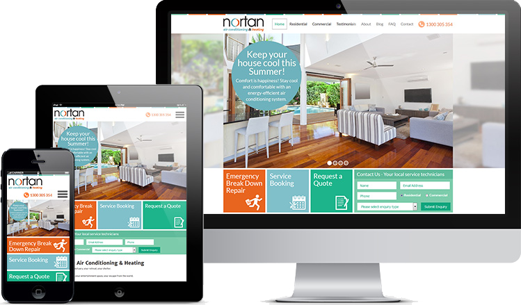
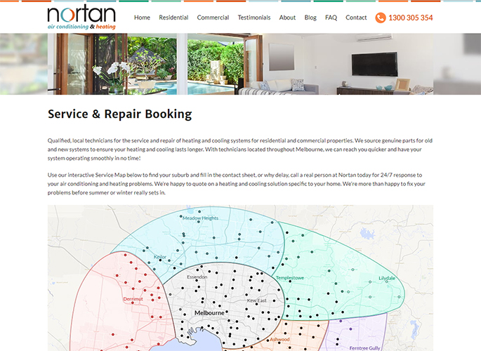
Terry & Megan Byron
Nortan


